Graphs: An effective tool, but use them carefully
8/27/15 / Matt Herndon

Ahh…the graph. Where would the business world be without them? While some of us are just as content looking through a giant spreadsheet full of numbers, graphs can help to illustrate the story more effectively for number geeks and math haters alike. However, while graphs can be a great tool, there are certainly times when graphs can make interpreting your data even more difficult to understand or (intentional or not) even misleading. Here are a few things to think about when creating graphs for your data.
Line charts should represent something linear!
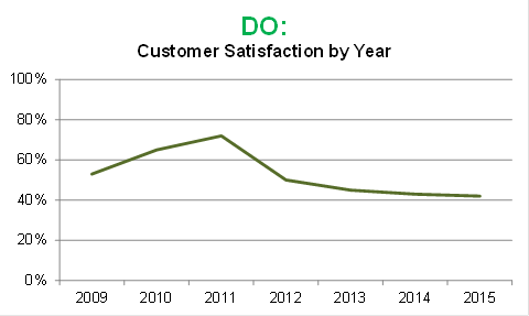
Line charts are a very common way of representing data. However, in most cases, line charts should only be used if there is some sort of linear relationship in the categories displayed on the horizontal axis of your chart. For example, if you want to see how responses vary by age of respondents, the year the data was collected, or even satisfaction on a numeric scale, a line chart can be a great way of representing this data.
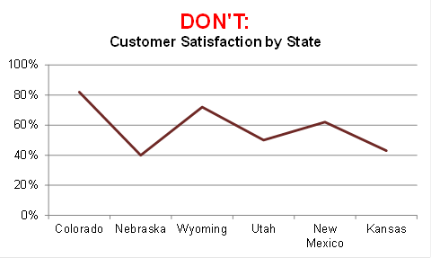
However, if you are instead dealing with categorical data, using a line chart suggests a relationship between the categories that may not be true. In the example below, a line chart implies that Colorado is related to Nebraska in the same way that Nebraska is related to Wyoming. Clearly this isn’t true, so in this case, a bar chart would likely be a more effective way of presenting the data.
Pie charts (and split-bar charts) should add to 100%!
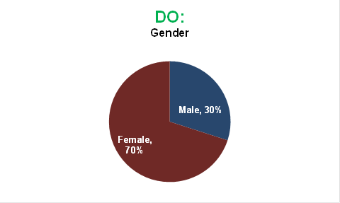
Everyone loves pie charts. Not only are they the best type of graph to use if you want to represent your favorite food (or video game character), they are an excellent way of presenting the distribution of data in which every data point belongs to one category.
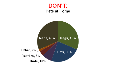
However, pie charts can cause all sorts of problems in interpretation if the data is not mutually exclusive (that is, if a single data point can belong to multiple categories). In the example below, the pie chart implies that the chart represents the total population in terms of pet ownership, but some people may have multiple types of animals. Again, in cases such as these, a bar chart would be a much more clear way of presenting this data.
Be careful with the scales you use!
While bar charts can be a good option for a wide variety of data, the scale you use for your charts can cause confusion in interpretation if you aren’t careful. In particular, if you let your graphing software choose your scale for you, you may end up with results that tell a very different story than reality! For example, let’s say you wanted to compare customer satisfaction across customer segments. If you pulled out trusty old Excel and graphed this data with no modifications, here’s the output you would get:
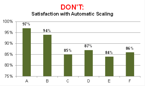
Even with the percentages listed on the graph, it looks like there is a HUGE difference in the satisfaction of Segments A and B compared to the others. However, the difference in satisfaction between Segments A and E is really only 13 percent. Here’s the same data, but using a fixed scale from 0 to 100 percent:
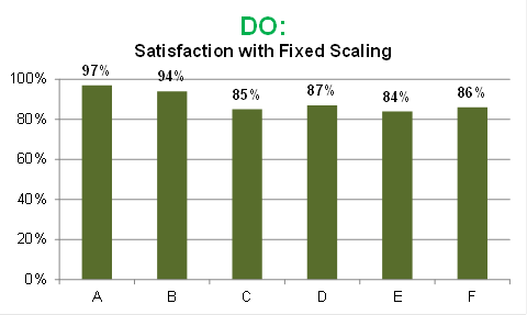
By ensuring that the scale represents the entire range of possible responses, we can more accurately convey the true differences between segments.
Other things to consider
These are, of course, just a few things to consider when presenting your data. We haven’t even touched on other topics like overall charting philosophies, how newer visualization techniques can result in pretty, but dysfunctional graphs, or the nuances of more advanced types of visualizations, such as cartography. However, by keeping in mind what your data is meant to represent and ensuring that your approach avoids some of these pitfalls, you’ll be on your way to more meaningful and accurate graphs.