4 ways to report customer satisfaction
3/17/14 / David Kennedy
In my previous post we discussed two common types of satisfaction surveys. In this post we’ll touch on the many ways to report results.
Suppose we have the following question:
Q: Taking into account all of your experiences with X, please rate your overall satisfaction with X:
- Extremely satisfied
- Moderately satisfied
- Slightly satisfied
- Neither satisfied nor dissatisfied
- Slightly dissatisfied
- Moderately dissatisfied
- Extremely dissatisfied
How would you go about reporting the results? (For simplicity, I’m only focusing on one simple question and other question/response types may require different summaries. Several questions could be combined into a common metric as well.)
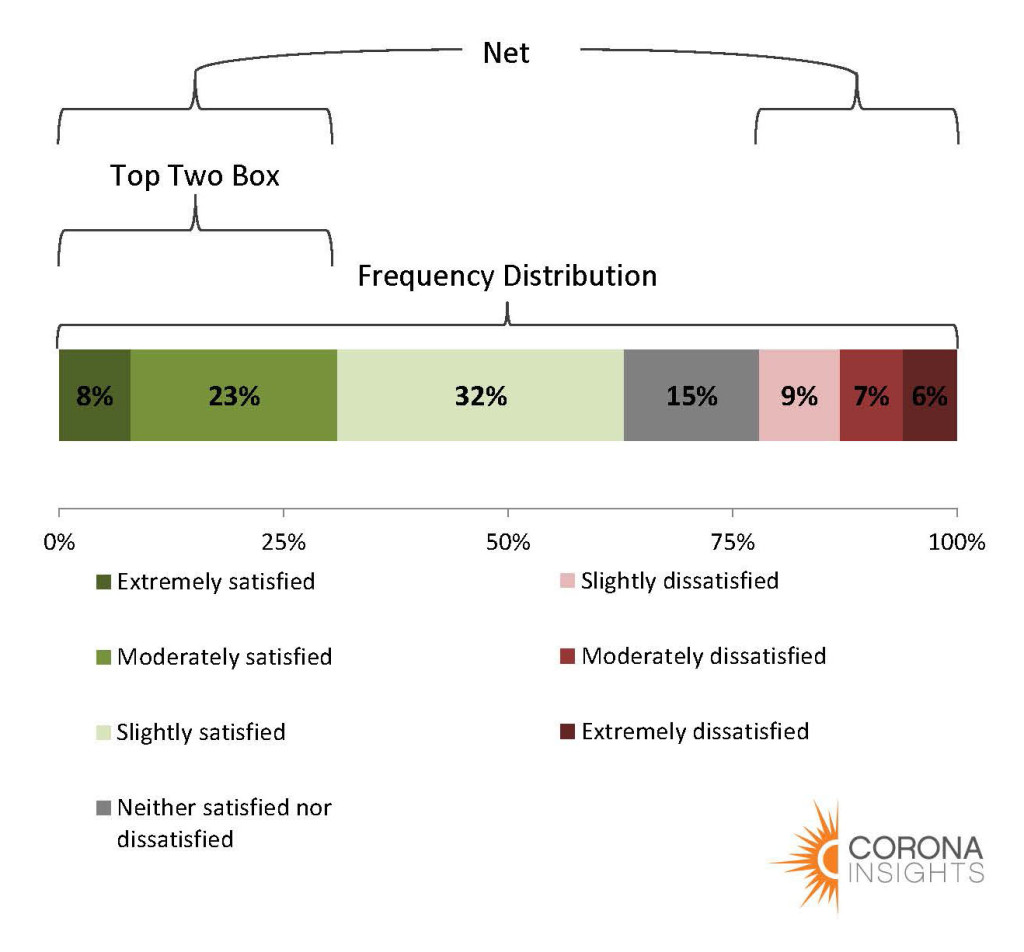
Report the number of responses for each response option (i.e. frequency distribution). This option reports everything, but leaves a lot of points to track. What do you care about the most? Any satisfied response? Only the most satisfied?
Top Box/Top Two Box. Here we look at the percent who responded “extremely satisfied” (top box) or “extremely + moderately satisfied” (top two box). It provides an easy, single metric to track. It assumes we care most about the most satisfied customers while ignoring movement on the lower end of the scale (we miss seeing if we move people from dissatisfied to neutral).
Net. To calculate a “net” score we subtract the percentage of responses from one part of the scale from the other. Often, this is taking the very satisfied and subtracting the least satisfied. This takes into account more of the scale, but you have to be careful where you make your breaks (Who do you count as satisfied? In this example, it probably would not be the top three boxes actually.) The Net Promoter Score ™ is the most popular version of net scoring.
Mean. Finally, we can calculate the average level of satisfaction by assigning a number to each response option and then calculating the mean. “Extremely satisfied” = 7, “Moderately satisfied” = 6, and so on (yes, we’re treating ordinal data as interval data). This gives us a single metric that takes into account the entire scale and is often a good measure to use for tracking as it places an emphasis on trends rather than a single point. However, it’s often not as intuitive for management. What does a 6.2 mean? Saying 80% of customer are satisfied (like with a top box score) can be more concrete.
This, of course, is just a primer and there are additional ways to summarize and report data, satisfaction, loyalty, or otherwise. Keeping your goals and audience in mind, as well as fine tuning as you go, are the best ways to effectively communicate results. Corona works with each client to develop a research program and reporting process that is tailored to their goals. There is no one-size-fits-all approach.
Have you had experience with these scales? What worked best for you?

